
Of course! The world has been waiting for a currency conversion tool. After all, there’s nothing like that anywhere on the internet. 🙂
No, that wasn’t the goal of this little project. The idea behind it is different.
Picture this: you have a topic and a task, and you know that all the data you need can be found somewhere online. So you get to work: you search, find, download, and model everything in Excel until you finally have it all lined up properly, removing discrepancies caused by missing master data or inconsistent transaction data, and eventually arrive at a result. Great! Done! Your analysis is so good that your management now wants an updated version on a weekly or monthly basis.
What a shame! Now you’re back to square one, realizing this topic and task will be accompanying you for quite a while.
How do you avoid that? Make sure you plan for “automation” in good time. Automate your tasks with Power BI. Once you’ve finished creating your report and published it to the Power BI Service, it can be refreshed hourly, daily, or weekly. Of course, the initial setup will involve more work, but the time you save by not constantly reinventing the wheel (and by avoiding the same pitfalls over and over) is totally worth it.
Just like in this “report” here:
The report uses only publicly accessible sources:
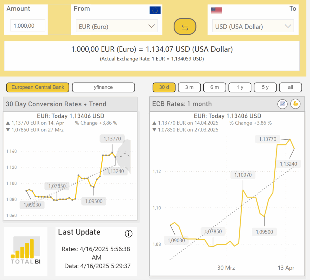
Exchange rates from the European Central Bank (download of a zipped CSV file that is processed and prepared in Power BI)
Exchange rates from yfinance (connection and download of currency data via Python)
Current exchange rates from themoneyconverter.com (snipped directly from the website’s HTML)
All the dimension tables also come from the internet (currency abbreviations, country tables, GDP by country, flags, and so on).
You can already see here that Power BI provides access to a huge range of data sources. In this project, I tried to use as many different types of interfaces as possible, and whenever there was an alternative, I tried to integrate a new type of interface.
Another focus of this report lies in various “practical” tricks:
How do I create a switchable visual that changes dimensions or data sources at the touch of a button? (For example, see the source control in the “20-Day-Conversion Rates + Trend” visual or the timeframe change in the “ECB – Rates” visual, which works just like it does on Google or Yahoo Finance—nowadays pretty much standard.)
How can I completely change and visualize metrics at the touch of a button? (For example, the button that reverses the currency calculation from EUR->GBP to GBP->EUR.)
What are the possibilities and limitations of dynamic title and subtitle generation in visuals?
…and so on and so forth.
You can already tell, without diving into the details, that there’s a lot going on in this model!
Need support or assistance with your project? Feel free to get in touch with me!