

No… I am neither a climate skeptic nor a climate denier, nor do I question a subjectively experienced global warming. What drives me in this project is the curiosity to see whether a sober and objective examination of the data leads to results that correlate with those presented in the media. I leave the conclusions to others; I merely provide the data.
What data are these, and how can Power BI help manage and effectively visualize them? That was the motivation, and additionally, I have always wanted to engage with large volumes of data.
The data sources are entirely and without exception available online. For the dimension tables (states, countries, geographical or political assignments), I use numerous sources. The weather station list comes directly from the WMO itself and contains a list of stations in the five-digit range.
Objective: To collect weather data (temperature and precipitation) from 1991 onwards, aggregate it into monthly averages, and divide the data into two categories:
-
Reference Period – a 20-year interval from 1991 to 2010
-
Observation Period – from 2011 onwards, which can be compared to the reference averages.
This setup includes selection options (states, climate zones, continents, countries, down to the smallest unit, the weather station itself).
Data Sources for the Fact Tables: I utilized two sources: data from the German Weather Service (DWD) (available for retrieval/download) and an interface to Meteostat. The primary source is the daily temperatures and precipitation amounts from Meteostat. A Python script on my MySQL server reliably performs this task, converting up to 15,000 daily records into monthly summaries and making them available for Power BI. The DWD data serves as a backup and no longer contains granular daily data; it is already aggregated into monthly summaries.
Why a Backup? The data is not always complete; there are months and stations for which no regular data is available, or the data has significant gaps. Therefore, I fill in gaps with available DWD data when necessary.
Compromise: I focus my presentation only on stations for which I have current data, meaning those that are still operational and have been in operation long enough. I include these “qualified” weather stations in the report filtering; all others (new or those with incomplete data or no longer operational) are excluded.
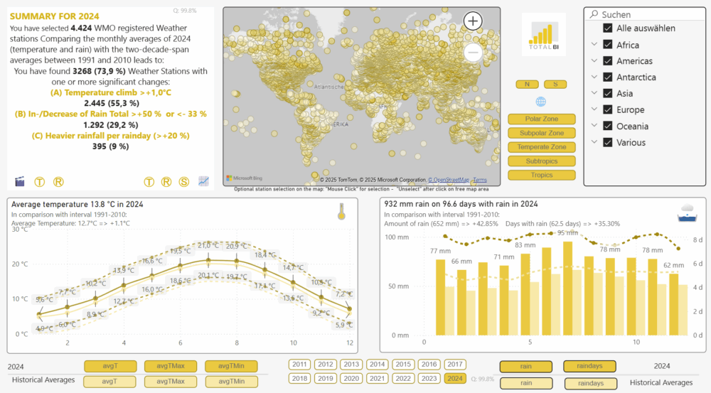
Filter Set: Currently, approximately 4,430 weather stations.
Averages: A quick look at the map already reveals a dilemma. The numerous points, each representing a weather station, are not evenly distributed; on the contrary, industrial nations in Europe and the USA are significantly overrepresented. This means that any calculated average is likely skewed by the overrepresented regions in the overall dataset! However, a fine-grained filter on a single country (Germany) should work quite well.
In an update, I will address this and cluster the stations into equally sized areas so that the result becomes more globally representative.
Another drawback is that weather stations are naturally found on land masses. Weather stations are not built on water. Therefore, the measurements from “weather buoys” are not included in the dataset at all. This means that global statements can only be made for land masses; ocean areas are missing.
Nevertheless, it has become warmer, and if you enjoy to, play around with the data. Filter down to your neighborhood and region. Confirm your perception of a cold winter or hot summer in 2015, or refute it. Use the numerous “tooltips” that reveal further information and animations.
“As you can see, even without delving into the details—there’s a lot packed into this model!
Need support or assistance with your Power BI project? Feel free to contact me!”